01The Ultra-Bold Counter Paradox
Heavy display fonts and extra-black typefaces create substantial visual presence on digital screens, yet their internal negative geometries harbor critical failure points for physical cutting. As letter weight increases, font designers routinely expand outer contours outward while squeezing internal enclosed spaces (the counters in glyphs like 'e', 'a', 'g', 'B', and '8') down to hairline apertures. On screen, these pinprick counters remain crisp pixels; on a cutting mat, they represent impossibly tight closed loops that a drag knife cannot track without destroying surrounding material.
When the cutting plotter attempts to carve an internal loop with a diameter smaller than the blade offset clearance, the swiveling cutter tip drags across its own entry mark. The resulting cut produces an unweeded tear, chewed vinyl shards, or an unintentional compound path collapse where the inner shape lifts prematurely and welds back into the letter body during weeding.
Key Takeaways
- Small counters need a test at the intended material and finished size; there is no universal minimum width.
- Converting text to paths exposes tiny closed sub-paths that snag during automated weeding.
- Manual internal path scaling preserves glyph weight while creating stable, weedable negative islands.
02Blade Drag vs Microscopic Loops
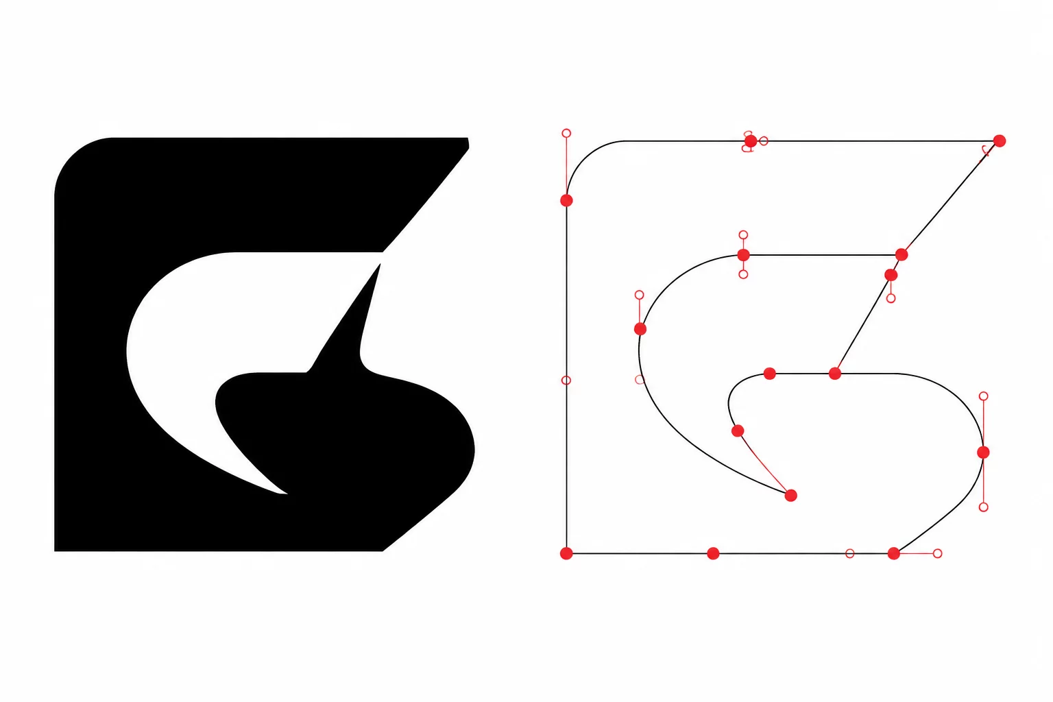
Tight internal loops can be difficult to cut and weed at small sizes. The result depends on the material, tool, and setup. Compare the visible counter with its actual closed path and preserve enough surrounding letter body for handling.
When the stroke weight expands outward and inward simultaneously, the inner aperture shrinks below the mechanical tolerance of a rotating drag knife.
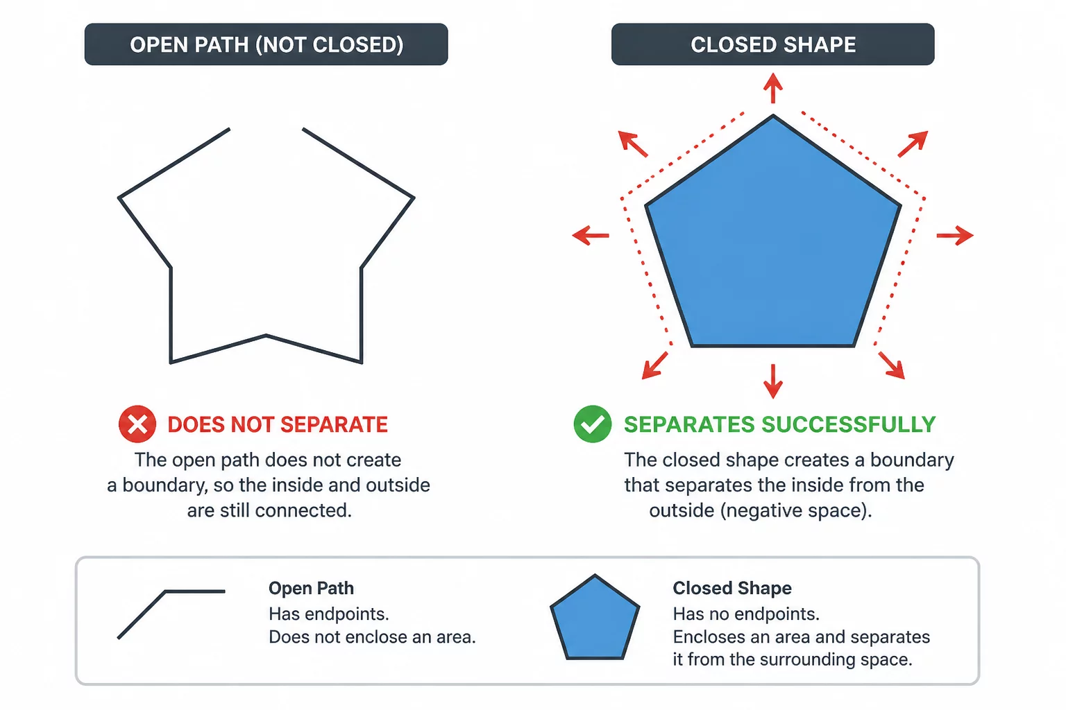
The physical consequence is predictable: rather than producing two clean separated shapes—an exterior boundary and an interior negative hole—the knife mangles the central island. During manual weeding, weed hooks cannot grab the sub-millimeter fleck of vinyl without dislodging the entire letter stem.
03Diagnostic Inspection Checklist
Before sending bold typography jobs to production cutting, apply strict vector diagnostic criteria to evaluate glyph inner holes against realistic cutter tolerances:
- Inspect letters like 'e', 'a', 'B', and '8' at 800% zoom in wireframe view to reveal collapsed counter paths.
- Inspect the narrowest counter clearance and the remaining letter wall at the final size.
- Apply an internal contour or negative offset solely to the inner loop without distorting the outer character hull.
Do not remove a counter merely because it is small. If it cannot be cut cleanly at the intended size, compare a larger letter, a simpler font, or a carefully widened opening while preserving legibility.
04Practical Correction Workflow
Converting display text into cutter-ready vectors requires a controlled three-step geometry treatment. First, convert text objects to raw vector paths by converting fonts to curves or outlines, which generates true compound vector objects. Second, release the compound path to separate the outer character hull from its internal counter loops. Third, adjust only the openings that need more clearance, compare the letter walls, and recombine the intended inner and outer paths. Verify both boundaries in the active cut preview and test at the final size.
This selective internal enlargement preserves the authoritative optical weight of the heavy font while granting the cutting blade sufficient turning clearance. Compare the weeded test with the intended letter, checking counter legibility and the strength of the surrounding strokes.